Date Tagging of Schedule
B2B SaaS, Enterprise, Information Architecture, Desktop Web
A tool for managing enterprise employee schedules, used by admins for both small business and enterprise level organizations.
Brief
Sprout’s Date tagging of Schedule (DTS) feature enables an HR Admin to manage and create the work schedules for their employees--a fundamental part of running a company.
The initial goal was to simply clean and revamp the interactions of the broad DTS features. It was such a legacy product that it was mired in conflicting data loops, inaccurate data visualization and representation; and it even had a severely limiting, and dated, interface.
The initial goal was to simply clean and revamp the interactions of the broad DTS features. It was such a legacy product that it was mired in conflicting data loops, inaccurate data visualization and representation; and it even had a severely limiting, and dated, interface.
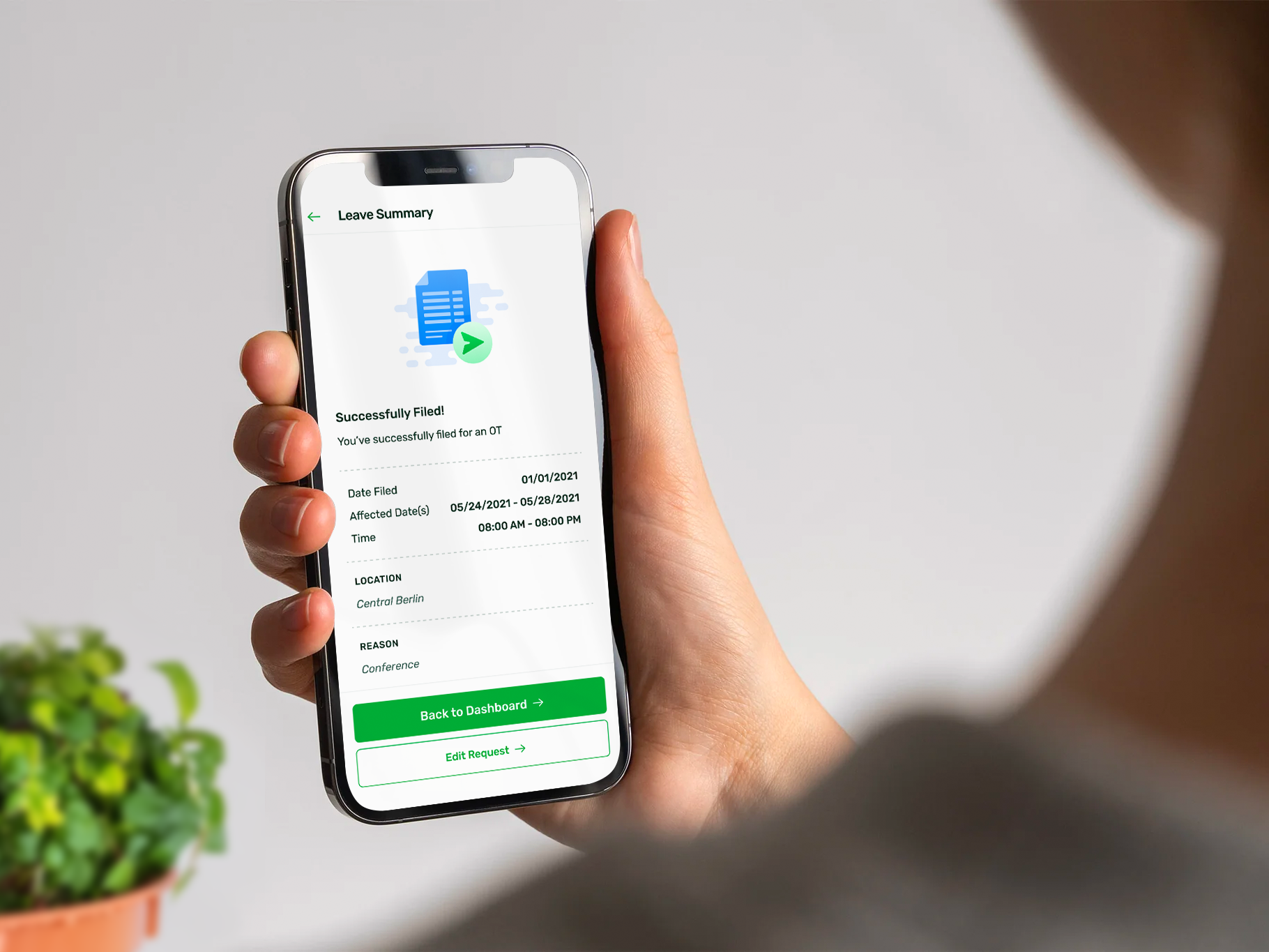
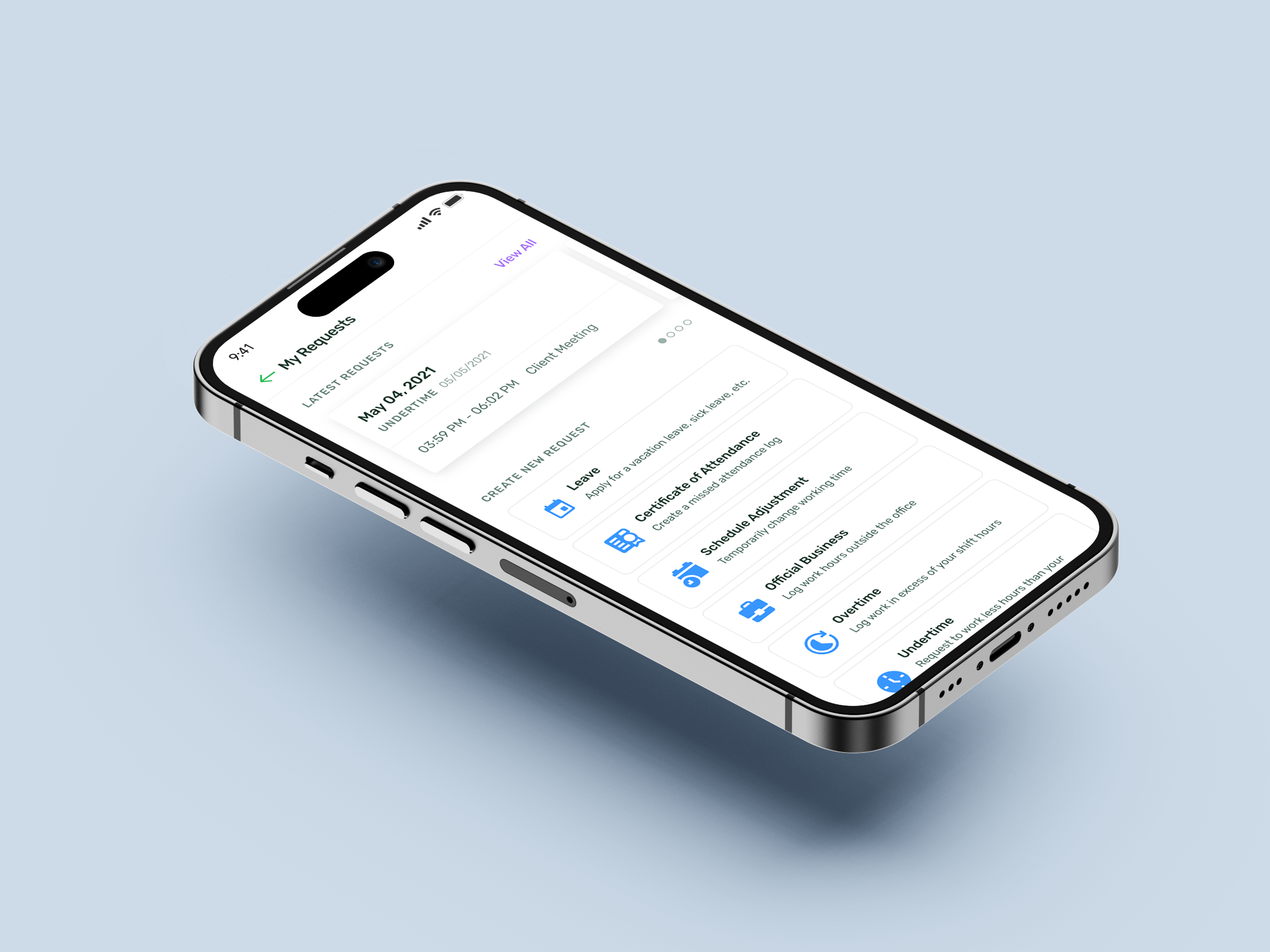
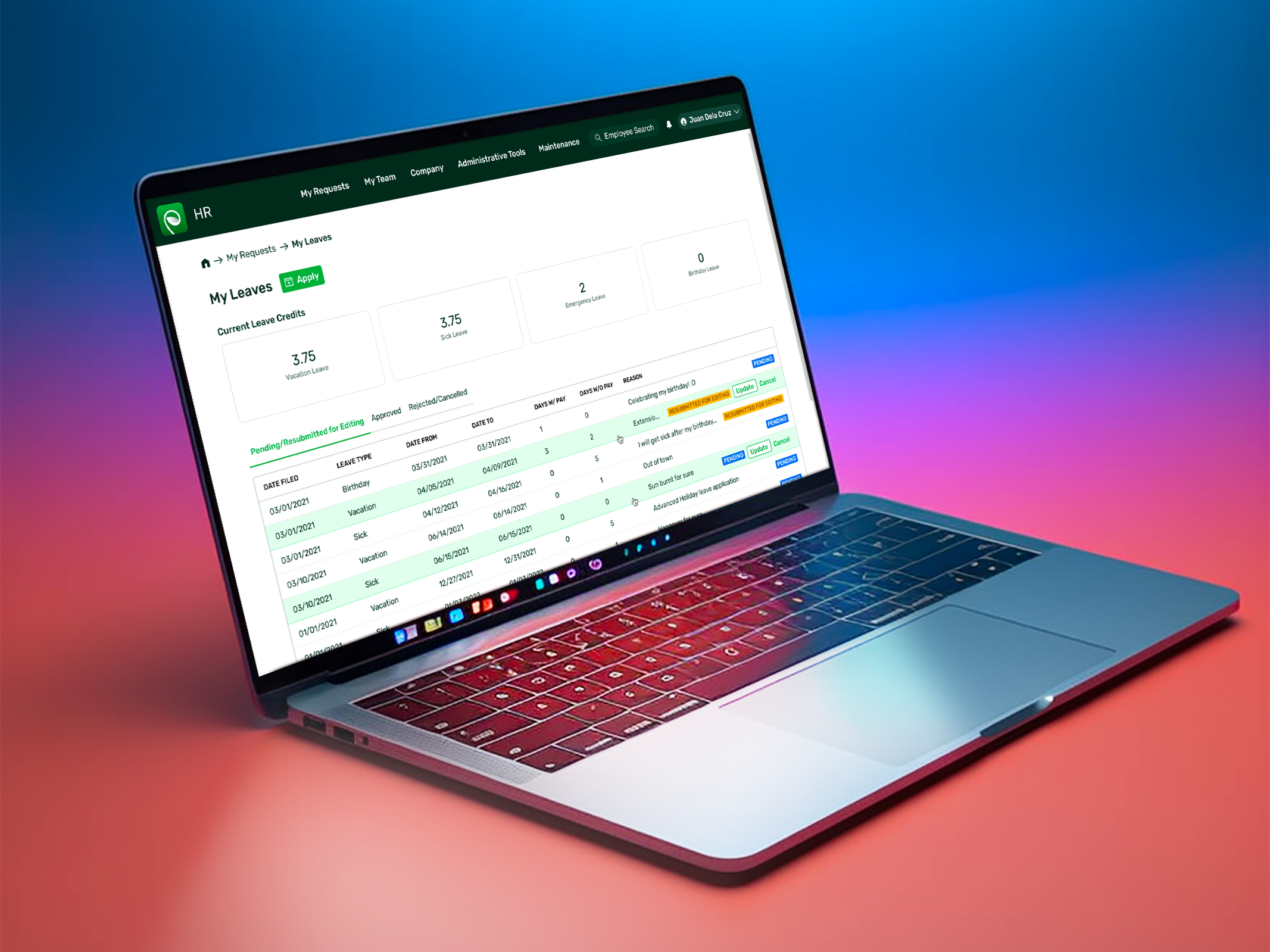
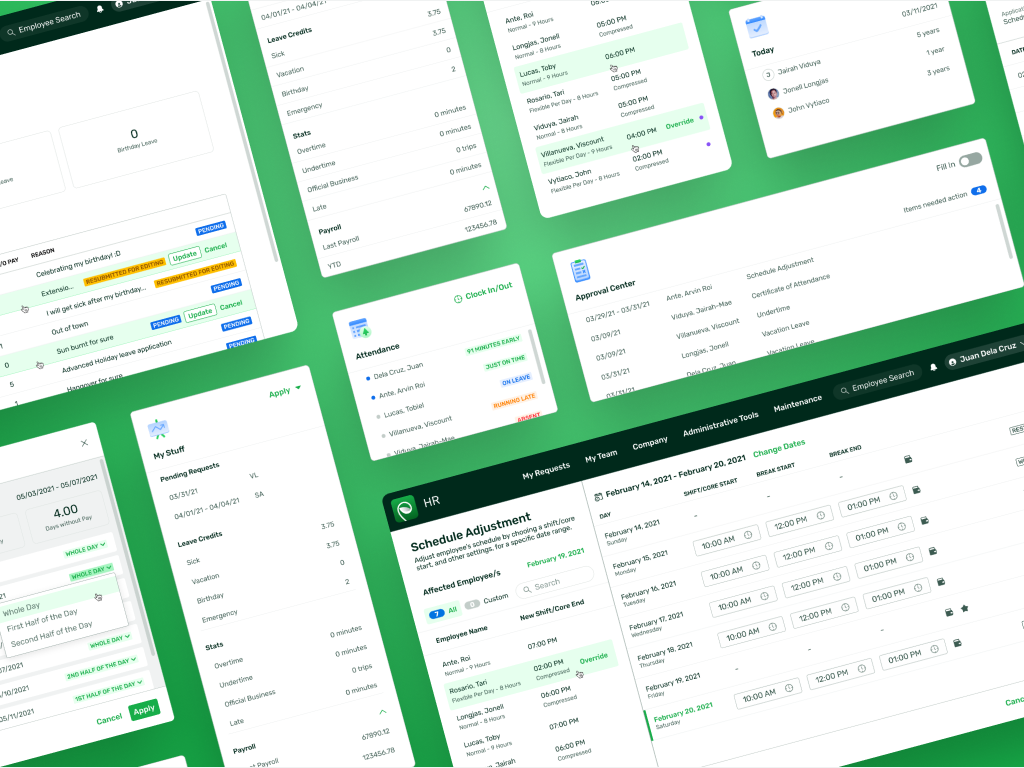
An overview of the final design
Solution
With fixes to several glaring UI problems and fragile UX flows; partnered with data from numerous client interactions, usability tests, ideations, and design reviews; we were able to push a complete redesign that accommodated the needs of varied industries and user experience levels.
The new design is such a fundamental improvement that it’s the precedence for the the modern aesthetic and usability direction of the entire product line.
The new design is such a fundamental improvement that it’s the precedence for the the modern aesthetic and usability direction of the entire product line.
The Design Process
Research and Overview
Our first step, as with any redesign project, was to understand what we were going to work with. We catalogued the pages, reactions, modals, and flows in the old design. This cursory review gave us a general idea about the effort needed to revamp things. It looked doable, but with some minor adjustments to obviously glaring issues.
Limited development effort, Nonexistent documentation, Legacy code, Incomplete information architecture, Complex and highly specific use cases.
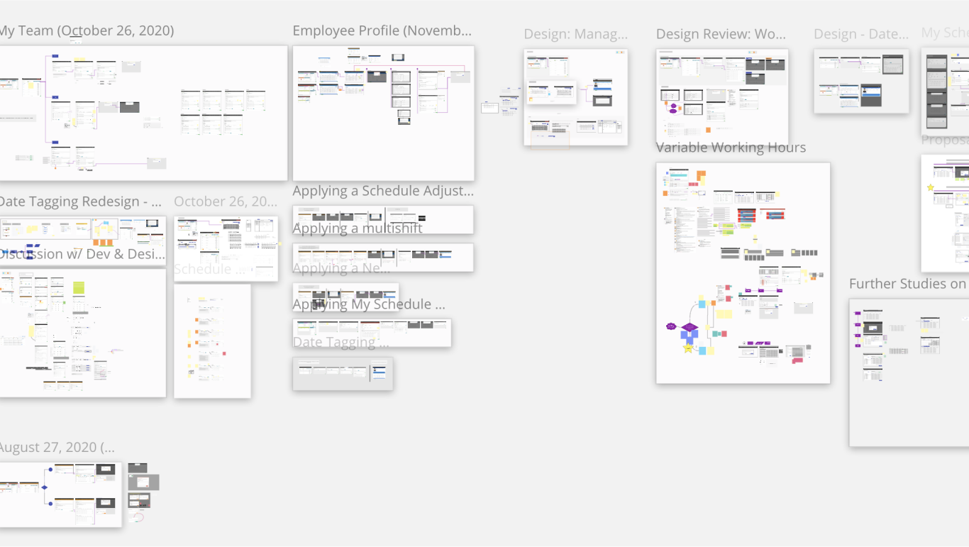
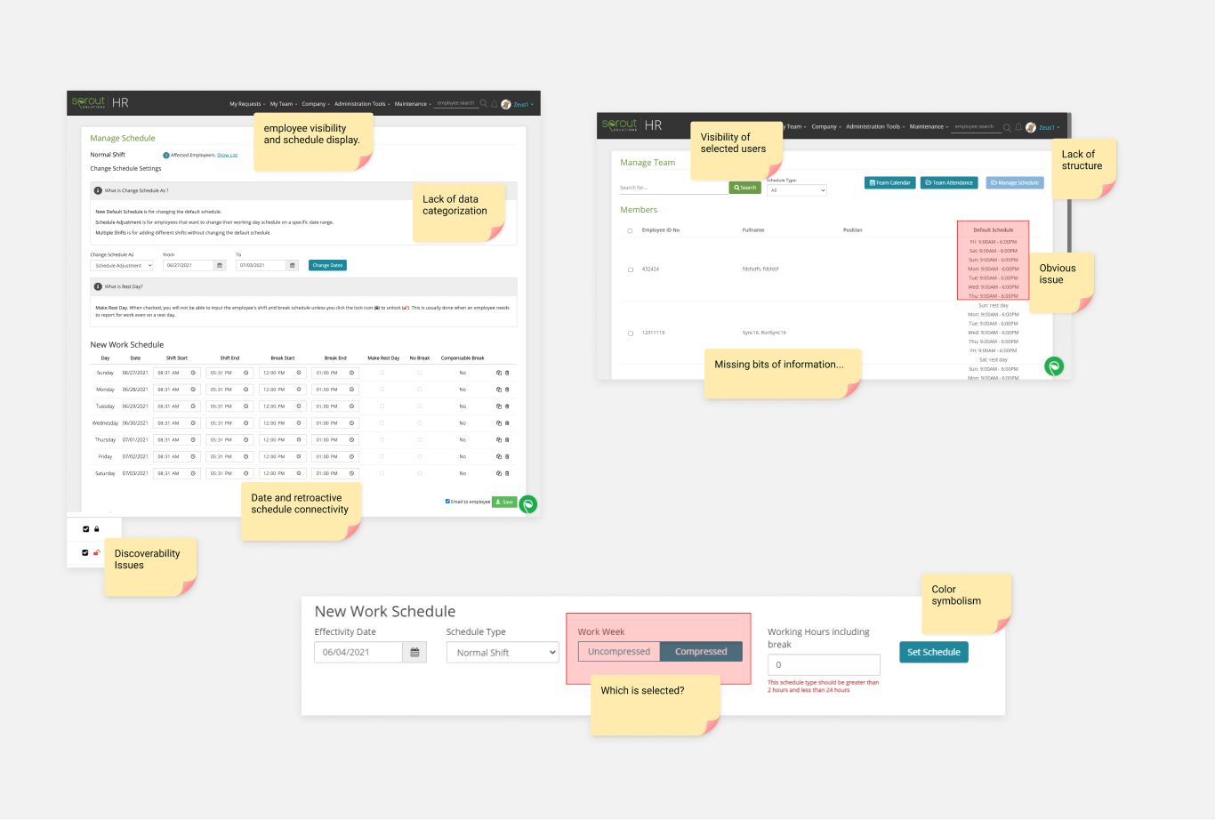
Initial Approach
Our first step was to focus on easiest issues to solve--the glaring UI problems such as: the toggle design, the visibility of the selected users, the layout of the data, proximity of data, button hierarchy, etc. And to aid in this new information architecture, we also better defined an understanding of the feature’s overarching purpose, as well as those in each page. Which made clear as to what bits of information were of primary, secondary, and tertiary importance.
Deep Dive
With all the bits of information vetted, fitted, and aligned, firmly in a new responsive screen template, the second step involved integrating the seamless transitions between each step in our happy path user journey. Our users, admins, want to create a new hour for a hundred employees. Easy.
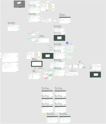
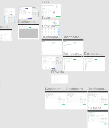
But what happens when we introduce the uniqueness of each employee? Let’s say some employee only need to clock-in once at the start of the day while the others have to at the start and end of their shift? Still easy.
But what if we start introducing employees who have different lengths of total working hours? Or, more complicated, if some of them only have different required hours of work in each day? Or what if some of those employees have total hours calculated not by day but by week?
But what if we start introducing employees who have different lengths of total working hours? Or, more complicated, if some of them only have different required hours of work in each day? Or what if some of those employees have total hours calculated not by day but by week?
And once you get the interaction matrix done for working hours and clocking-in/out, what if your admin is working with a distributed team and some of those employees have a local non-working holiday while others don’t?
There are so many levels of complication present in this system. The usual action for it is to cull some of them down and work only on the primary scenarios, not probably. But what if you’ve already done that, and we’re still left with a huge set of flows? Those that we can’t easily classify as extreme scenarios due to the nature of the (now passé) “new normal”.
There are so many levels of complication present in this system. The usual action for it is to cull some of them down and work only on the primary scenarios, not probably. But what if you’ve already done that, and we’re still left with a huge set of flows? Those that we can’t easily classify as extreme scenarios due to the nature of the (now passé) “new normal”.
Learnings
Looking back at our process, the most impactful method we applied was asking ourselves “Does this thing align with the primary goal?”
Whenever our Sales Team or Customer Success Department bring to light a curious little related scenario that one client had we ask if it’s applicable to the general user base, and if it’s aligned with the primary goal of the feature. Whenever there’s a new scenario before ask those questions to gauge whether it’s something worth tackling it here, or if we take note of it for another probable different but related feature in the future.
In the end, it was a good, and successful practice of systems thinking design.
Thanks for reading!
