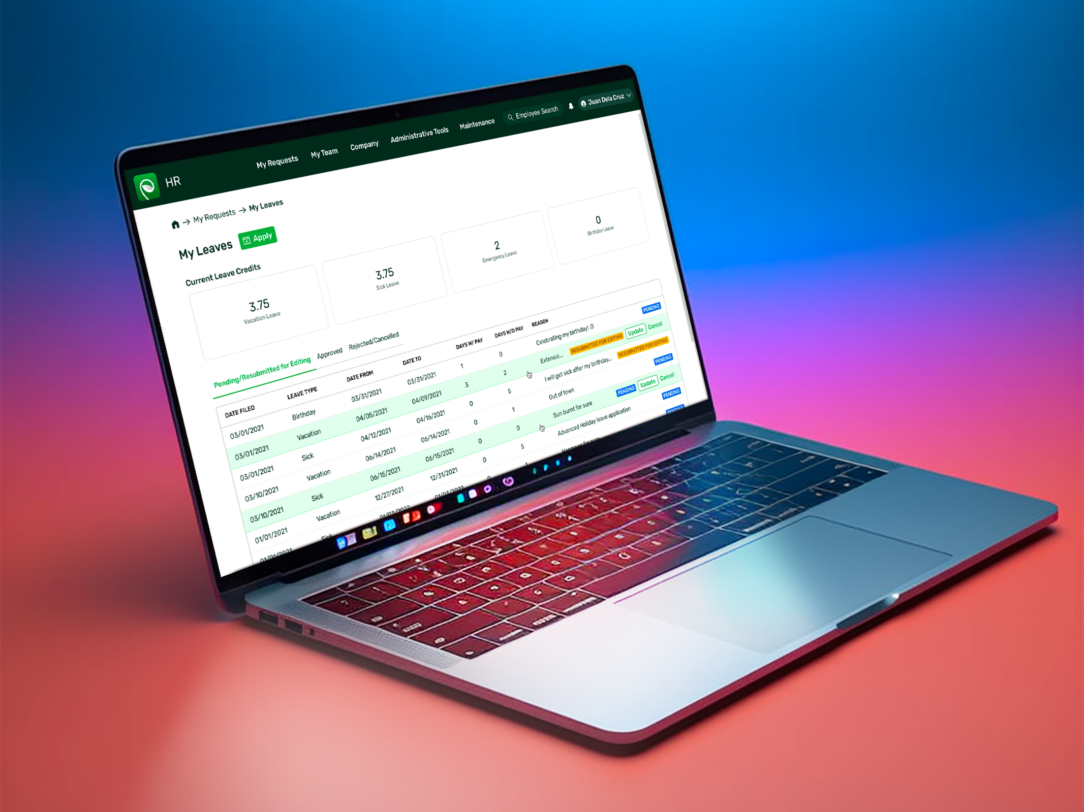
Attendance Requests
Mobile Companion App, Enterprise, B2B Saas, UX Design
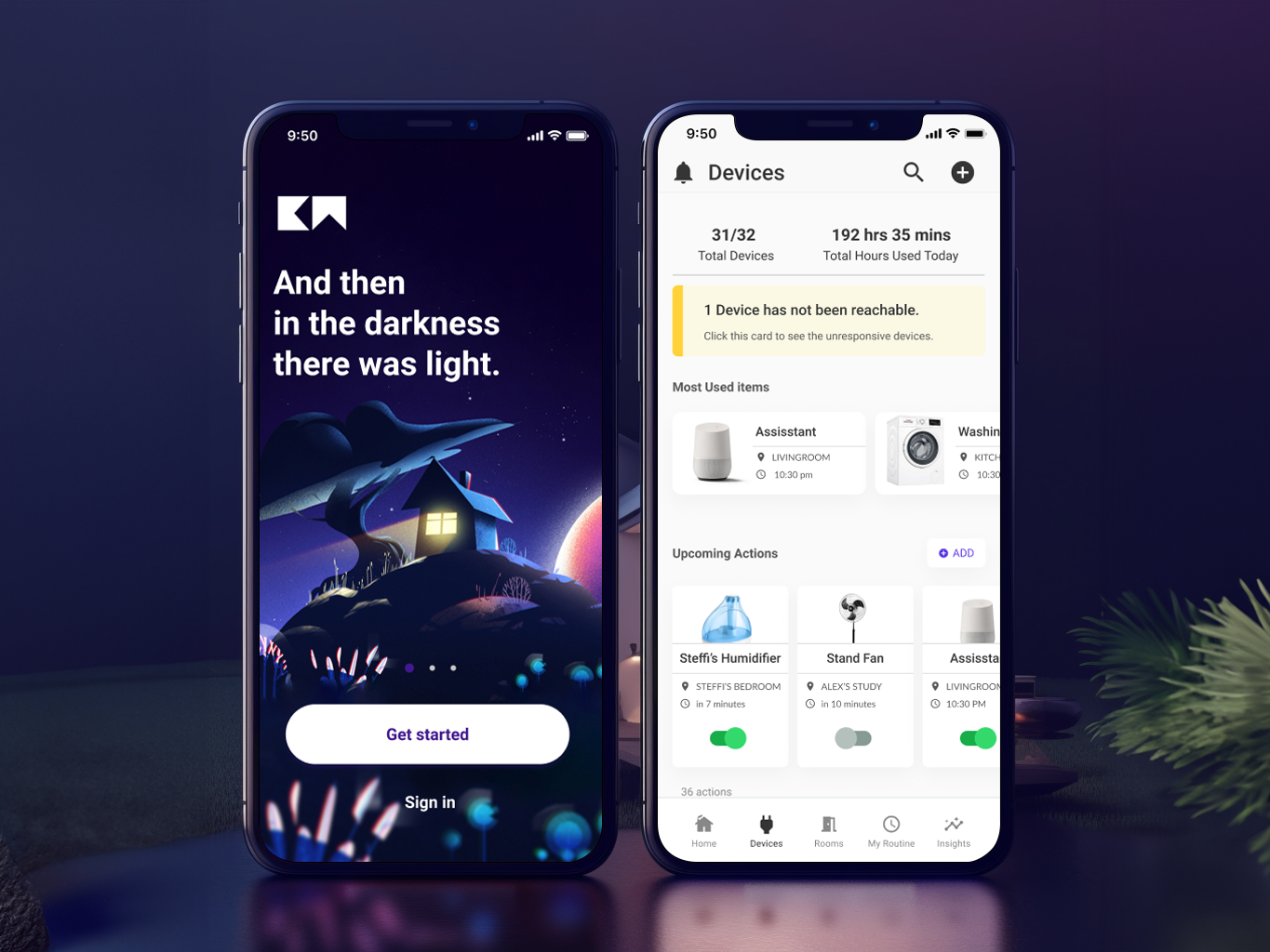
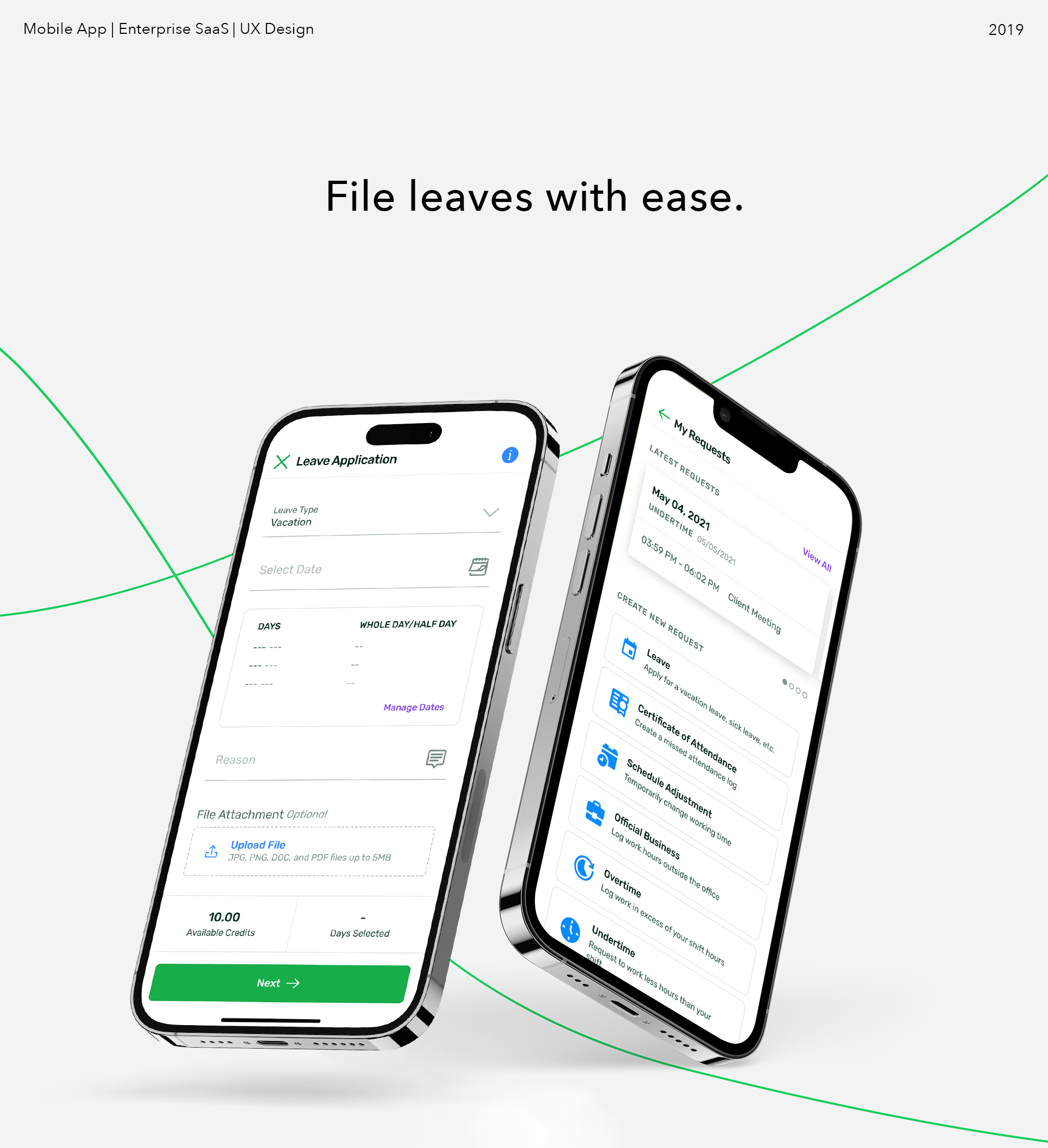
Live to work, or work to live? At the heart of every HRIS is attendance processing. The goal of this project was to take the most interacted part of the web platform into a curated mobile experience.
Brief
As data proves, attendance and leave management is arguably the most interacted feature of Sprout HR. Pushing to securely grow their mobile app to increase usability, versatility, and value. Sprout needed to allow users to do just that on their new mobile app.
Result
Developing the brand, improving the flow, and maintaining a designs across iOS, and Android.
We rebuilt how you file any attendance request from the ground up. A modular core customer journey, based off of research, enhanced through rigorous prototyping, and testing. This design for Sprout’s mobile app influenced the core (and aging) desktop web platform.
We rebuilt how you file any attendance request from the ground up. A modular core customer journey, based off of research, enhanced through rigorous prototyping, and testing. This design for Sprout’s mobile app influenced the core (and aging) desktop web platform.
I. Research
Quantitative analysis on leave patterns
To better inform design decisions, and improve user experience, I mapped out the previous year's attendance adjustment data. Understanding this usage data directly moulds the Information Architecture, and helps the Product & Design team as to which adjustment type to prioritize in the product roadmap.
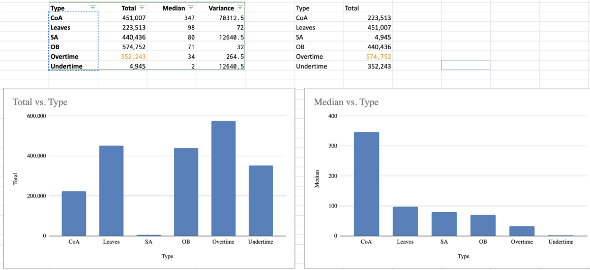
Note: This is a snapshot of 1 quarter's data, before omitting outliers.
In the quarterly snapshot above, the left side charts all the leaves filed into the system within a single quarter. The right side is the median length in days of each application. With this, and the rest of the year's data and other pre-existing interview data, we can safely say that there were more Leaves (Vacation Leaves) filed into the system, followed by OB (Official Business). Overtimes and CoA (Certificate of Attendance) applications, though more numerous, were deprioritized due to technical complexity.
II. Low to Mid Fidelity
UX Audit
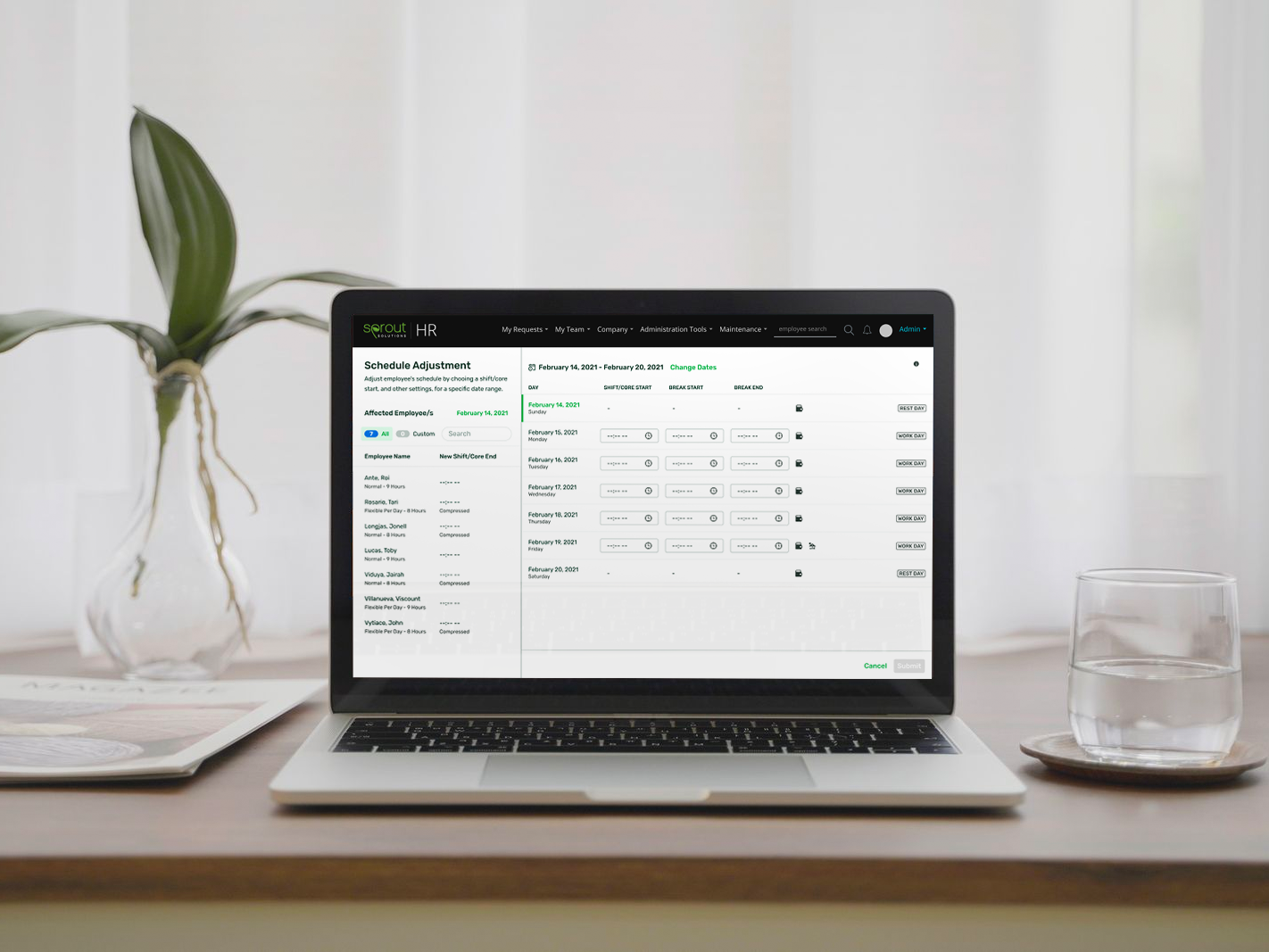
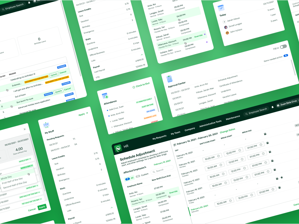
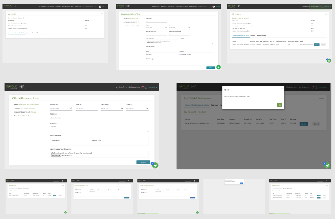
As this is a companion app the web platform's attendance request feature is diverse, mature, and the most used feature in the entire company's ecosystem. But, on a deeper inspection, as with the image below you’d notice inconsistencies in multiple parts of this legacy system. Such as in one application's field title's microcopy was "reason" in some and “Purpose” in others. Both words are used interchangeable across the different schedule adjustment types, and in the variants of those pages.
But the larger issues in some application types were the egregious use of space without proper utilization of proximity (programmatic adjacencies).
III. Workshops and Activities
Discovering customer wants, and measuring their needs. Though conceptually simple, this project meant a lot to the bottom line and necessitated moving fast but with reduced risk.
Beyond the UX Audit (understanding existing functions, system patterns, and activities) I also collaborated with Product Management, Engg, and other non-designers in ideations and mapping sessions. Other activities included conducting competitor benchmarking, Customer Surveys, User Interviews (for renewed feedback), support ticket reviews, and even interviewing internal stakeholders.
And with all the data*, jobs** (needs and variables), and even novel wants, we collaboratively measured them against profitability and effort to map dependencies and priorities.
*Often a pareto-like distribution manifests in data. Though strong biases can appear, it’s important withhold decisions until we reach the latter reflection stages
**Sample of JTBD: Streamlined Scheduling Process, Long Term Organization, Policy Adherence, Application Flexibility.
IV. Communication and Buy-in
Users Flows
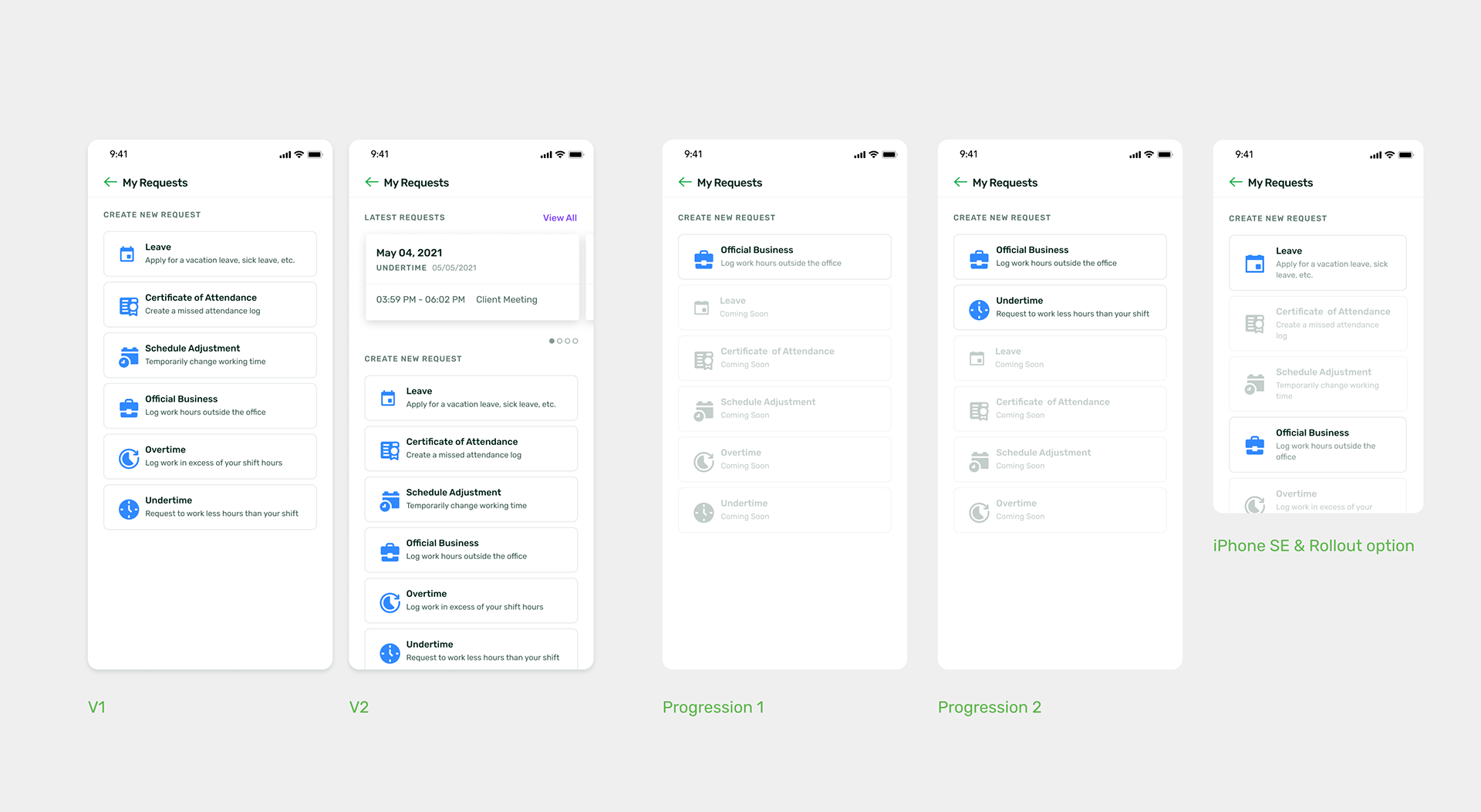
While issues like those were tagged and resolved within the internal team I also began rebuilding the overarching customer journey. Standardized across all attendance type. I began with the most complicated attendance type, based on quantity of variables and steps, the Schedule Adjustment. This meant applying the flow to latter variations were more a game of subtraction.
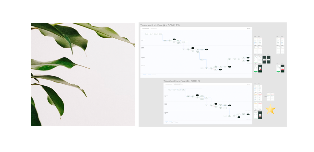
And the visualization of these flows came in multiple flavors. Each type’s flow has not just a base (simple) version, but multiple variations with progressive levels of detail. Progressive level of fidelity. By curating what we use per person I can avoid overreaching, overlapping issues and involvement, resulting in faster meetings, stronger buy-in, and high levels of documentation.
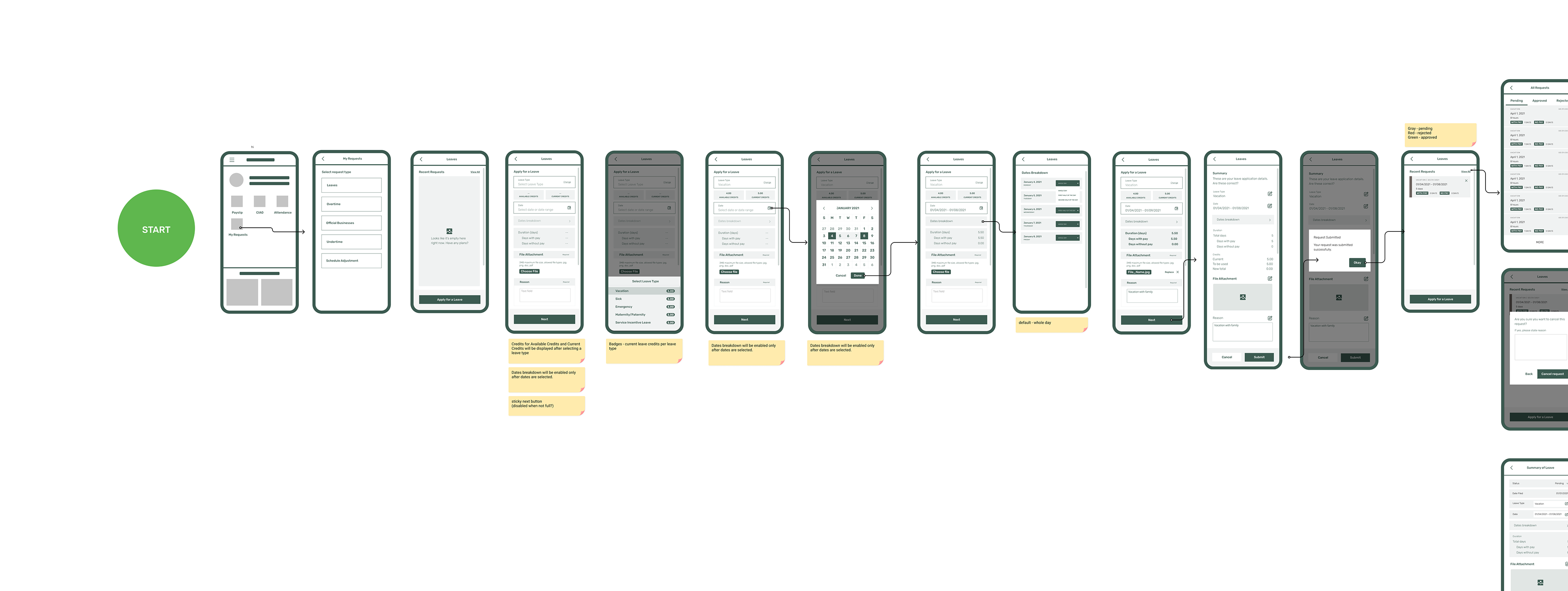
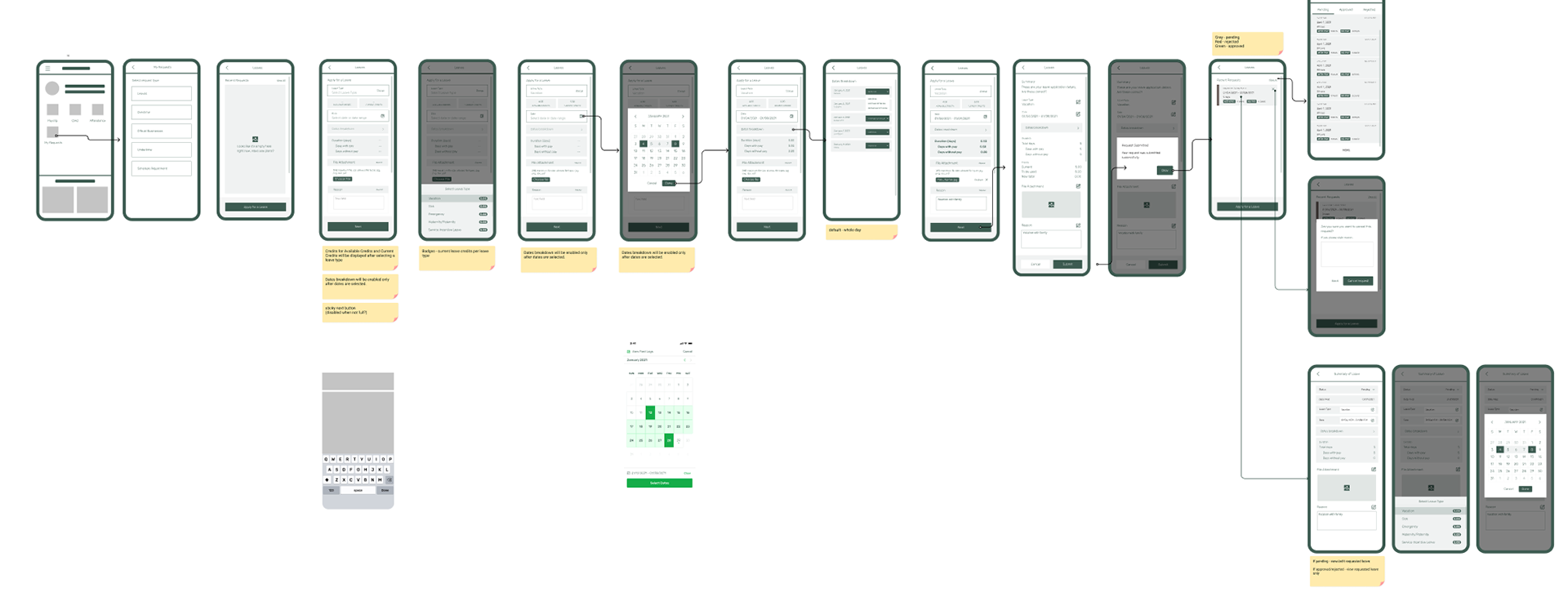
The simplified flow below is accompanied by a mid fidelity prototype. In parallel, a pattern (IA) for each screen, container, and each modal, began taking shape based on each step's relevant variables, attributes, and CTA's.
The simplified flow below is accompanied by a mid fidelity prototype. In parallel, a pattern (IA) for each screen, container, and each modal, began taking shape based on each step's relevant variables, attributes, and CTA's.
Note, this method of progressive flows involve a lot more effort for the designer. But the returns in clarity are undeniable.
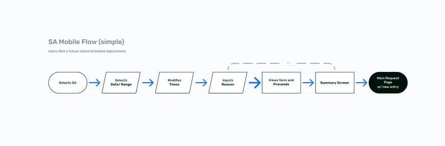
The simplified (overview) flow for filing a Schedule Adjustment on the mobile app.
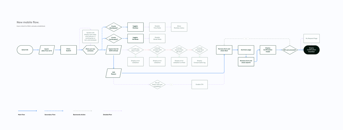
A detailed flow for filing a Schedule Adjustment for the mobile app.
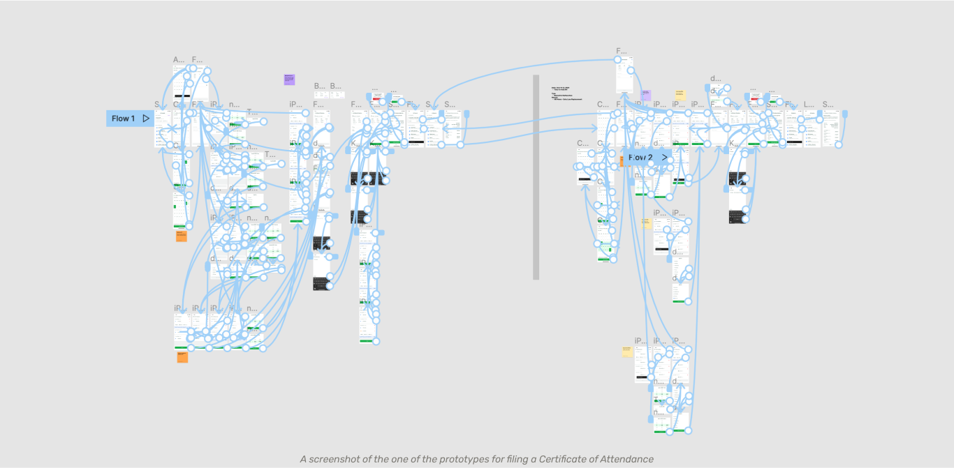
A flow with swimlanes of the different screens for filing a Schedule Adjustment for the mobile app.
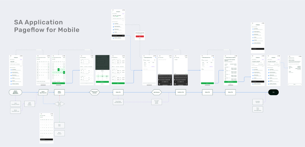
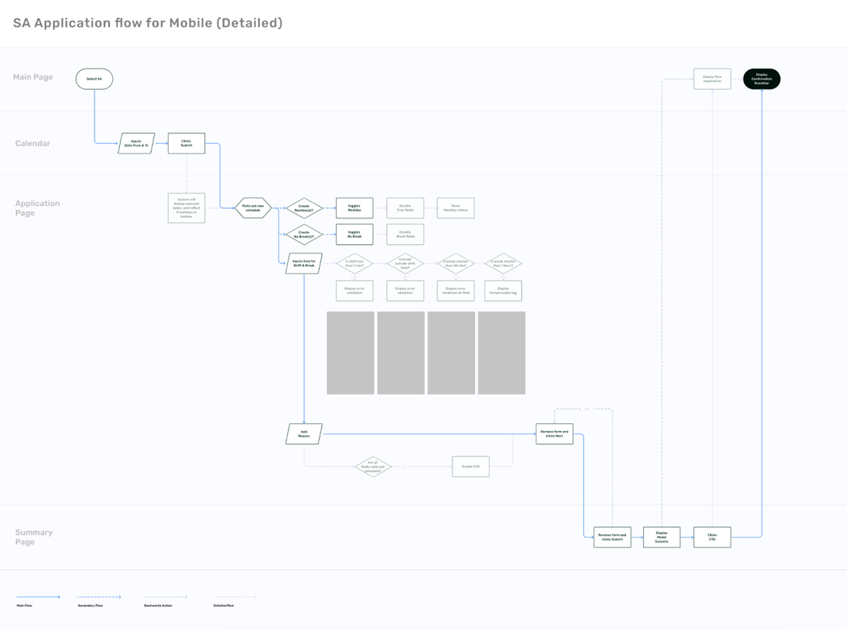
A pageflow for filing a Schedule Adjustment for the mobile app. Used in later stages of the PD Cycle.
V. Design and Ideations
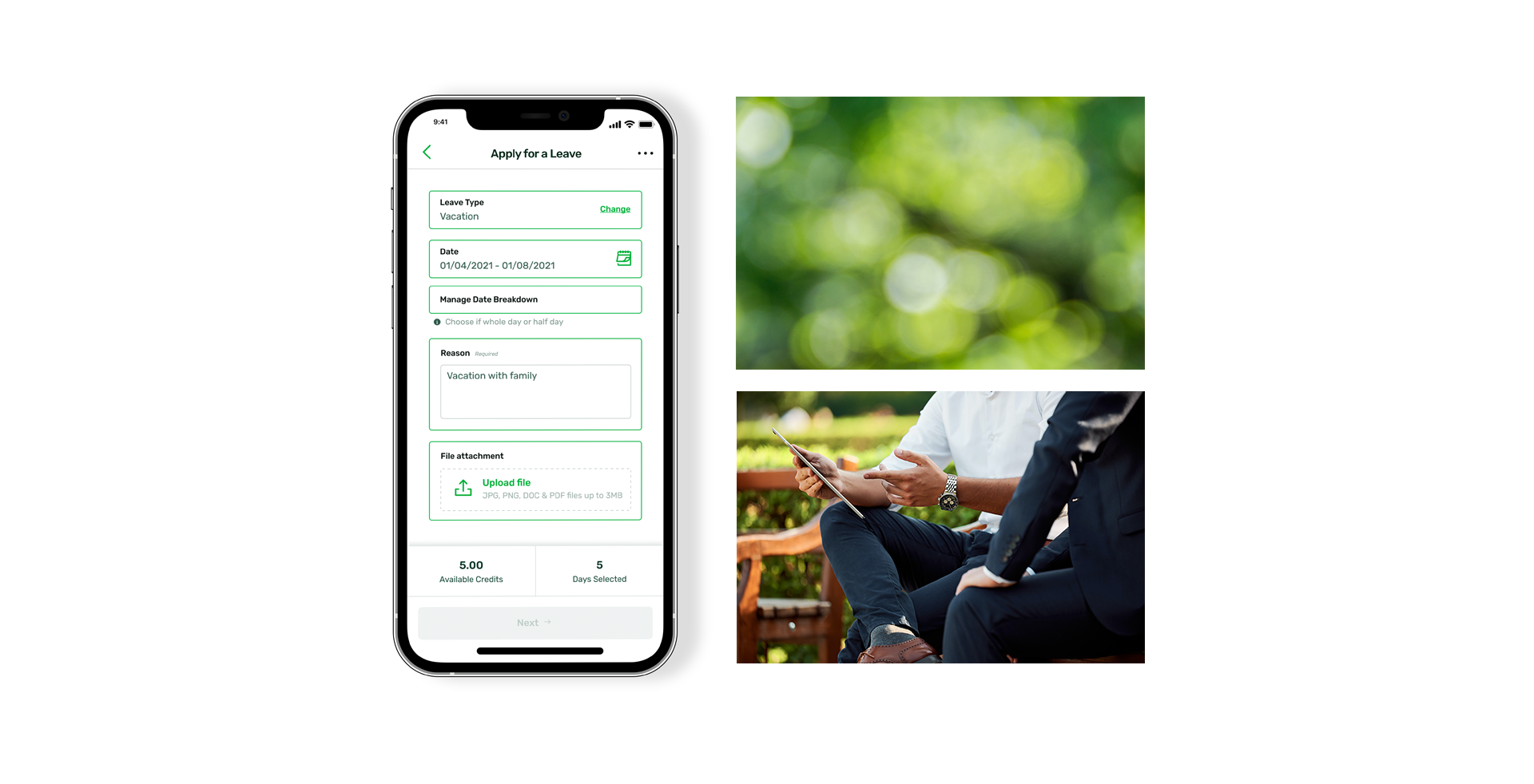
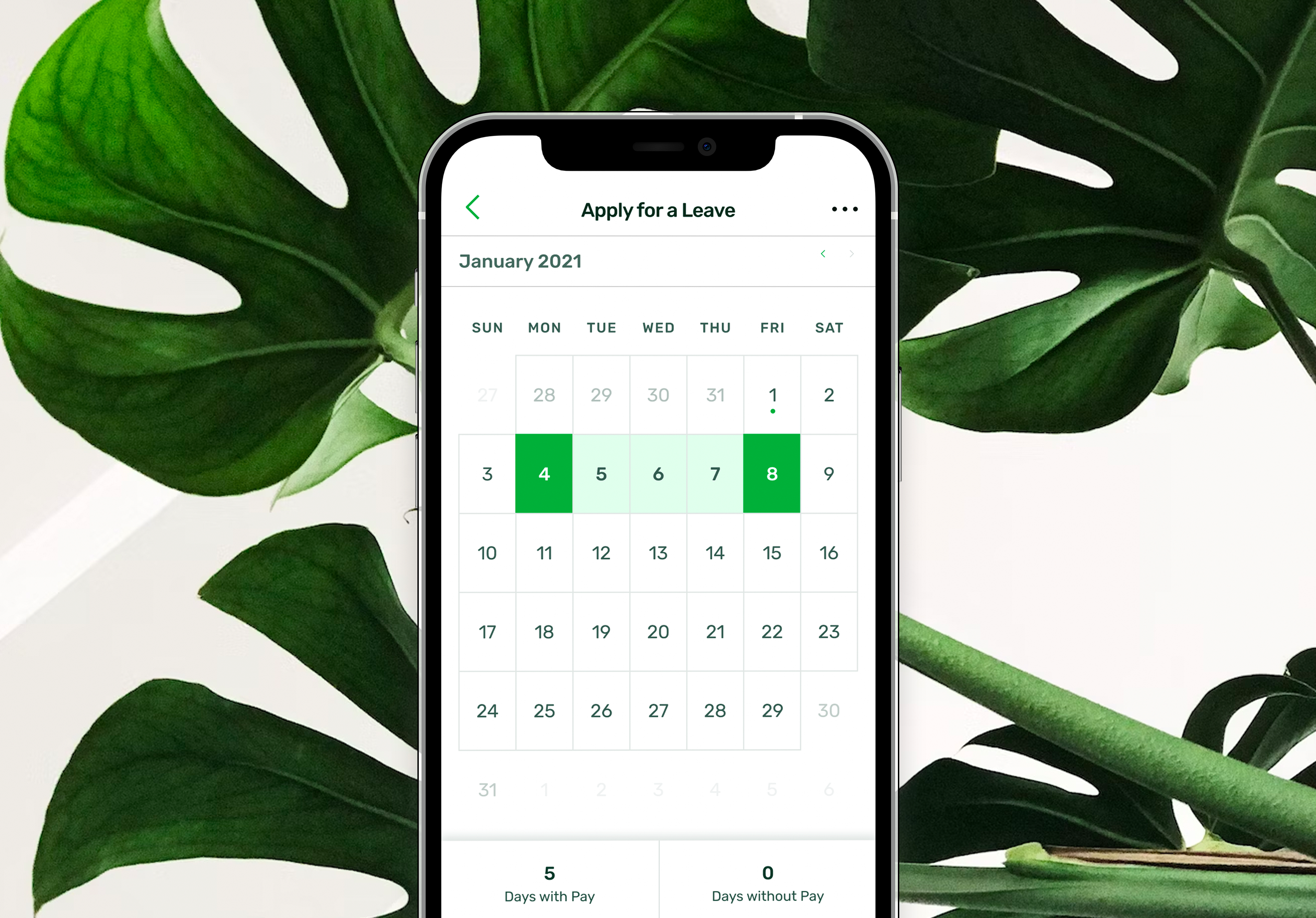
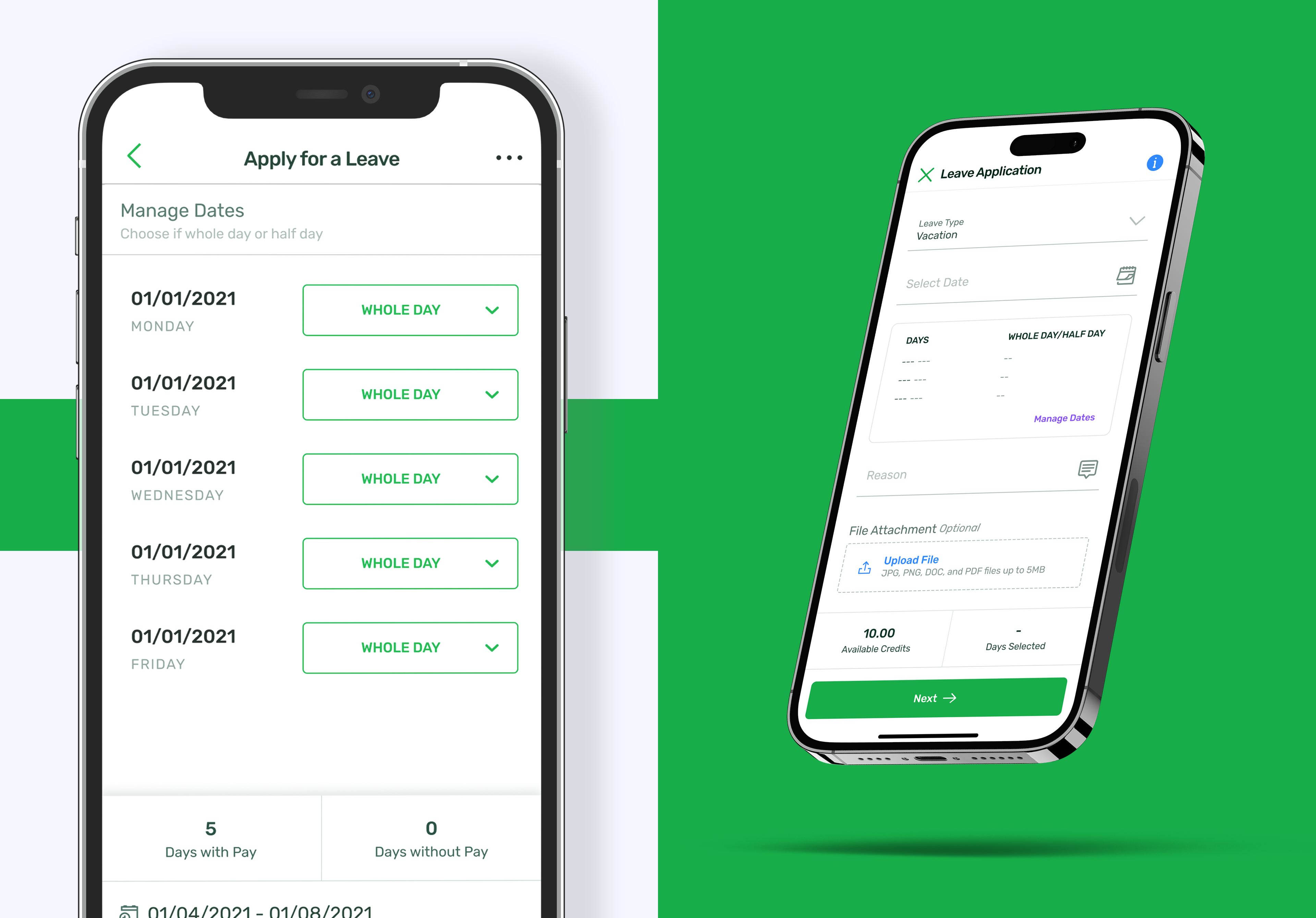
While the UX started with the 'Schedule Adjustment' Application type, the UI began with the ‘Leaves Request’ type. The flow condensed enough to display the most varied elements in a screen. Great for iterative design, and faster communication.
Zooming in, the design of a new calendar component took precedence. This new component is influenced visually by the new mobile Design System form fields and buttons.
And by using the ORCA method (organizing: objects, relationships, call-to-actions, and attributes), laid on the new flows, on the I began to discover deeper edge case. Issues that were complex and had long lasting impacts.
My primary tool in overcoming these issues are: Ideations sessions (some session also including non-designers), and Design Review sessions. This meant that we did not just just quickly discover solutions, but also quickly gathered internal commitment on solutions and directions.
My primary tool in overcoming these issues are: Ideations sessions (some session also including non-designers), and Design Review sessions. This meant that we did not just just quickly discover solutions, but also quickly gathered internal commitment on solutions and directions.


VI. Testing
It takes a few days to fully prepare all the necessary documents to conduct the user research. As we designed each application type we also kept notes on places we presumed friction/stresses would be encountered. Summarizing those note, juxtaposed to JTBD's, we arrived at a high-level perspective on how to build unique scenarios per application type, each with multiple scenarios of varying complexities.
Moderated Usability Testing was the bulk of the research method, dogfooding and with client. The rest were unmoderated tests.
VII. Development Handoff
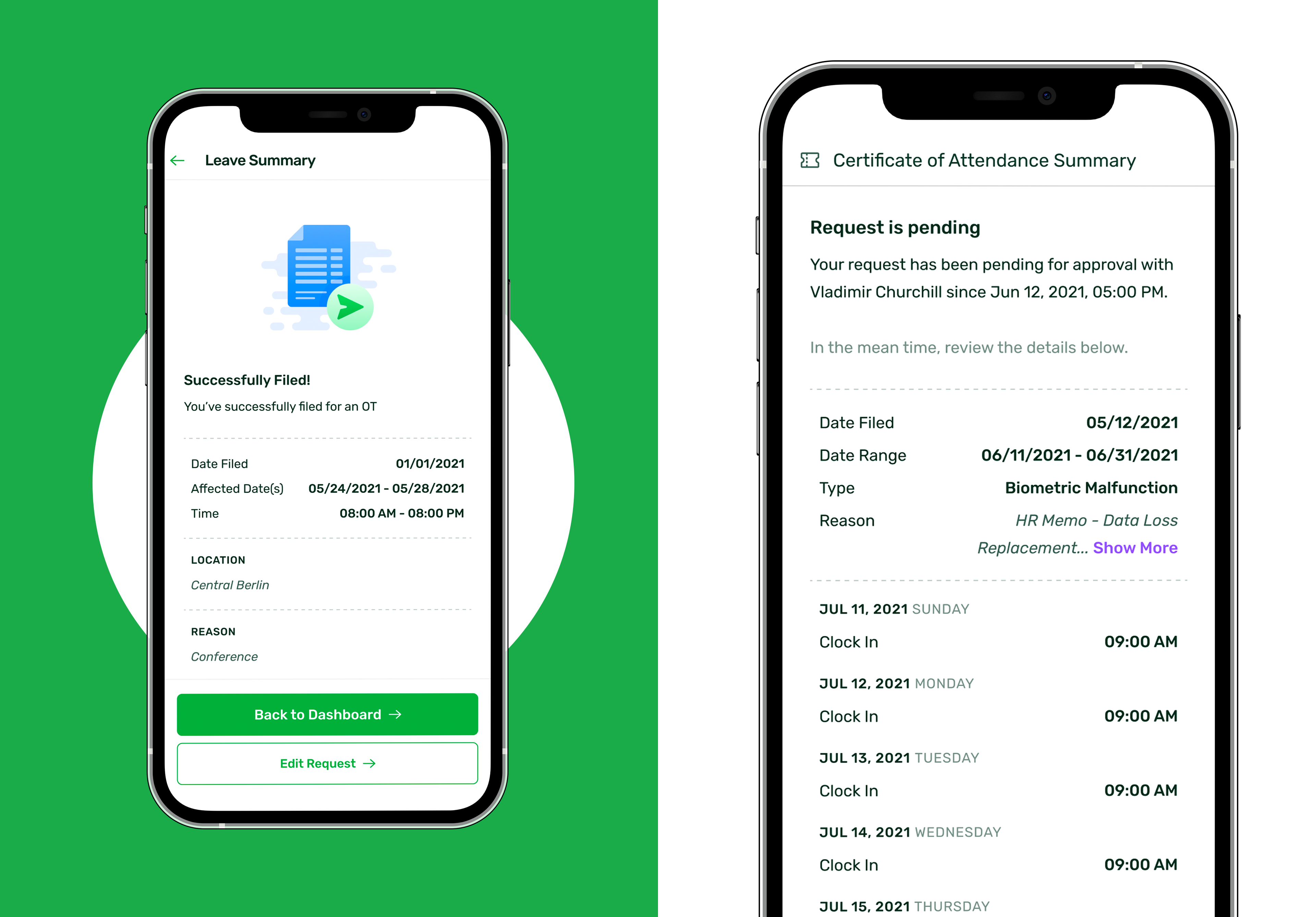
By the end of no less than 20 rounds of testing the major Attendance types (inclusive of iteration). Data was logged in an excel sheet, synthesized in the PRD, and with the page flow (seen above) we ran a final refinement to lay out a multi-stage development plan (accounting for eventual API availability).
At this stage, there should be no issues from development as both backend and frontend were included in multiple steps of the design cycle, as well as consulted during earlier reviews.
The app was to built in multiple phases, with OB (Official Business) first due to development bandwidth and POC's. The MVP ready for refinement and handoff for the first round of development.
VIII. Measuring and Progression
Measuring Success
we kept close communication with the Customer Success Manager of the first companies whitelisted into the feature. Informing them to probe and surface any usability issues, as well as dev. bugs.
We monitored not just clickthroughs within the app, but wanted to study if this new mobile accessibility affected previous filing patterns (if they’d be doing it at home, and how frequent and large are the applications) and in what industry. Data useful for our Insights journal.
While monitoring, we began working on the remaining Attendance types, high priority improvements such as Geo-Mapping, and qualitative features like Sentiment Analysis.
Retrospective
We already had a strong understanding of the customer needs with just our pre-existing research and the data on leave patterns. But since we were locked in by backend requirements we had gathered enough bandwidth conduct thorough research and analysis. This ‘luxury’, can be an indicator of the maturity of the project.
Thanks for reading!