UX/UI - BlackHut Smart Home App
Aiming to create a solution for managing a smart home's electric consumption in a family friendly manner. The app will provide an interface to monitor and control various smart devices, allowing users to optimize energy usage. Key features include real-time energy usage tracking, personalized recommendations for energy efficiency, scheduling of device usage, and integration with smart meters. The UI design prioritizes clear visualizations, and seamless navigation to ensure usability across all age groups.
Interviews
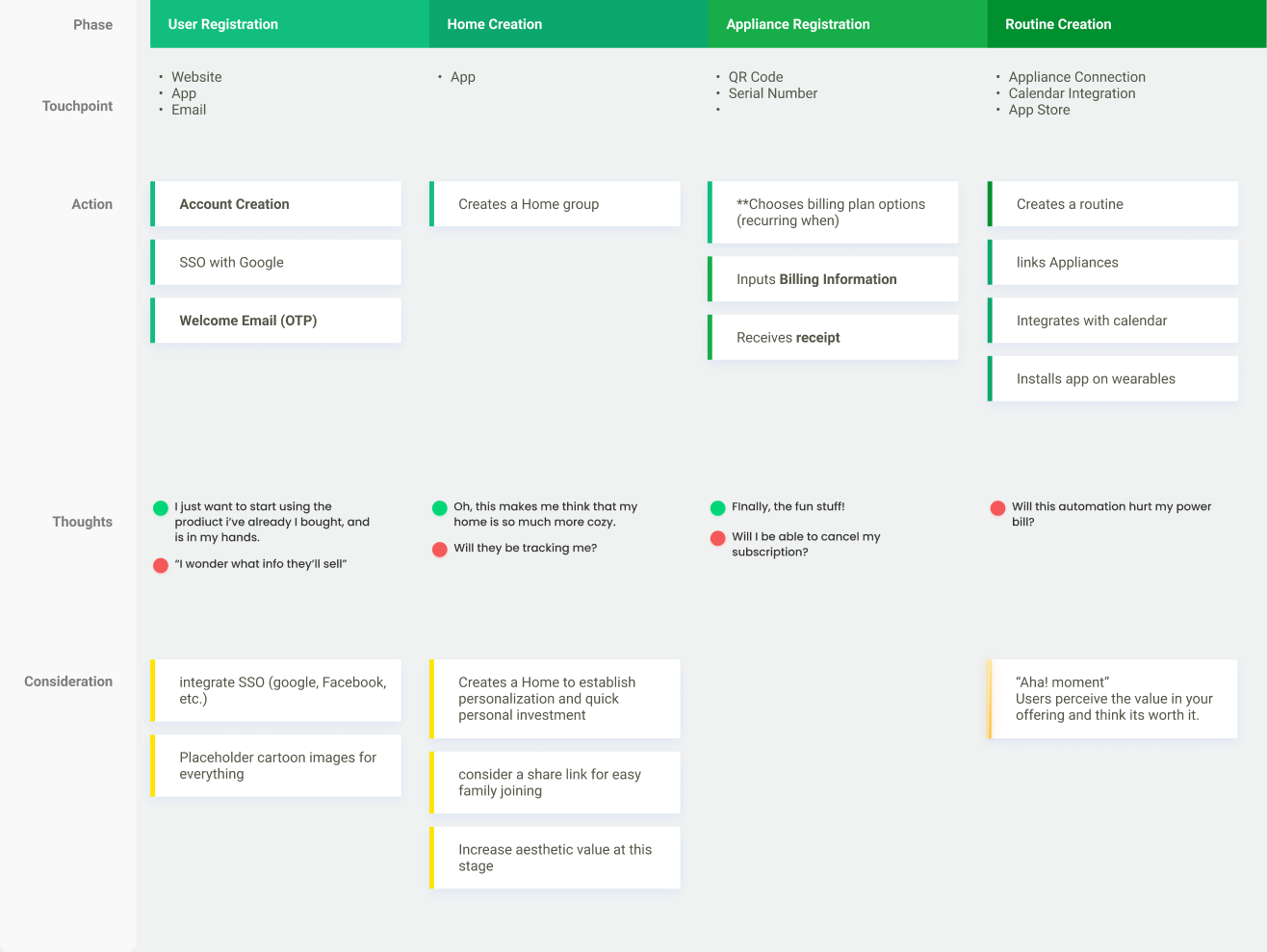
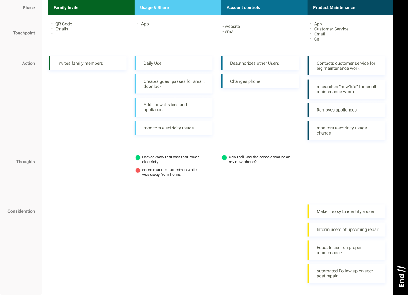
During the ideation phase, I recruited a diverse sample of 7 users (those that do and do not own smart-home systems) and conducted interviews in-person and remotely. I had a strong emphasis on capturing the target audience's motivations, daily habits, and ultimately their painpoints.
Two notable revelations: first, the vagueness that always surrounds energy consumption; and the other, were distinct focal points of each demographic group. These insights not only shaped the user flows to specific user profiles but also influenced the project's key user journeys.
Information Architecture
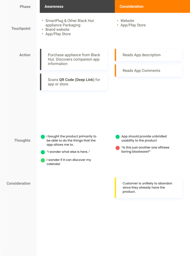
With an understanding of through customer journeys, painpoints, and goals, I employed a JTBD (Jobs-to-be-Done) framework to map out the interconnected touchpoints within the entire ecosystem. This gave me better objectivity to build the Information Architecture.
I could now better visualize the relationships between different major objects, such as rooms, appliances, and profiles, to ensure seamless navigation. To accelerate my design process, I also conducted ORCA (Objective, Resources, Constraints, Actions) sessions.
Low-Fidelity Design
Utilizing the power of Figma, I transformed initial sketches into sleek low-fidelity wireframes. These visual representations demonstrate the synergistic integration of various research data, including user interviews, painpoints, customer journey maps (CJM), jobs-to-be-done (JTBD), and information architecture (IA). The result is a cohesive and user-centric screen-by-screen approach that efficiently addresses goals and resolves user problems.



High-Fidelity Designs & Branding
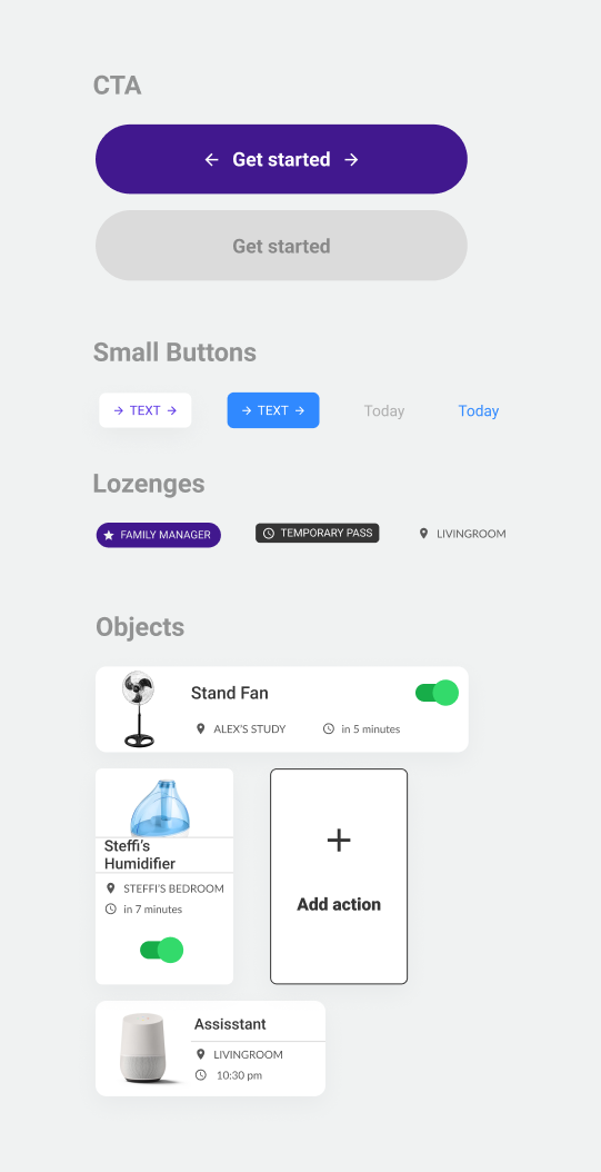
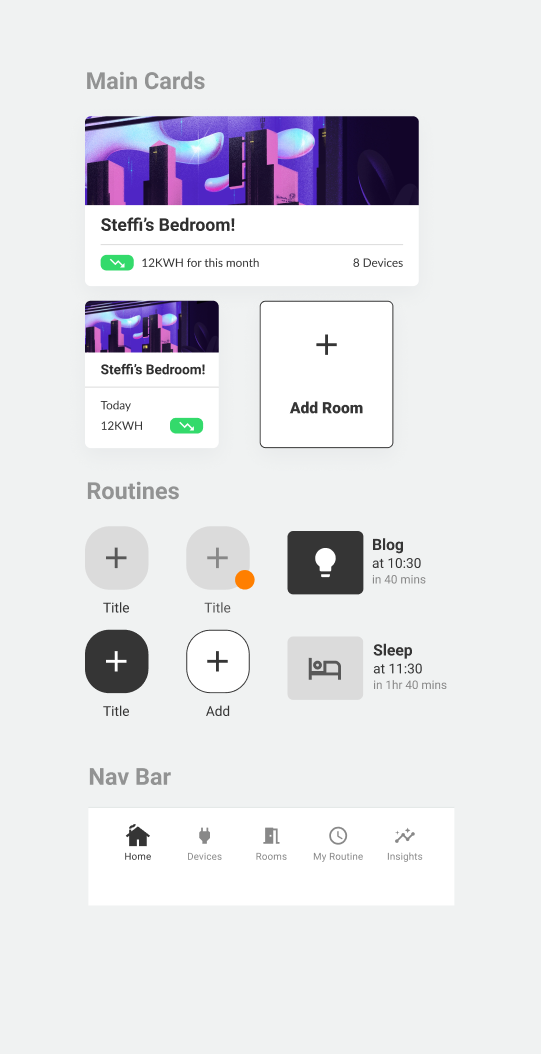
Infused with a captivating blend of quirkiness, style, and innovation, the brand exudes a sense of personality that resonates with both familial and personal connections.
While the app boasts powerful capabilities and robust data, I intentionally chose certain directions to strike at a few key areas:
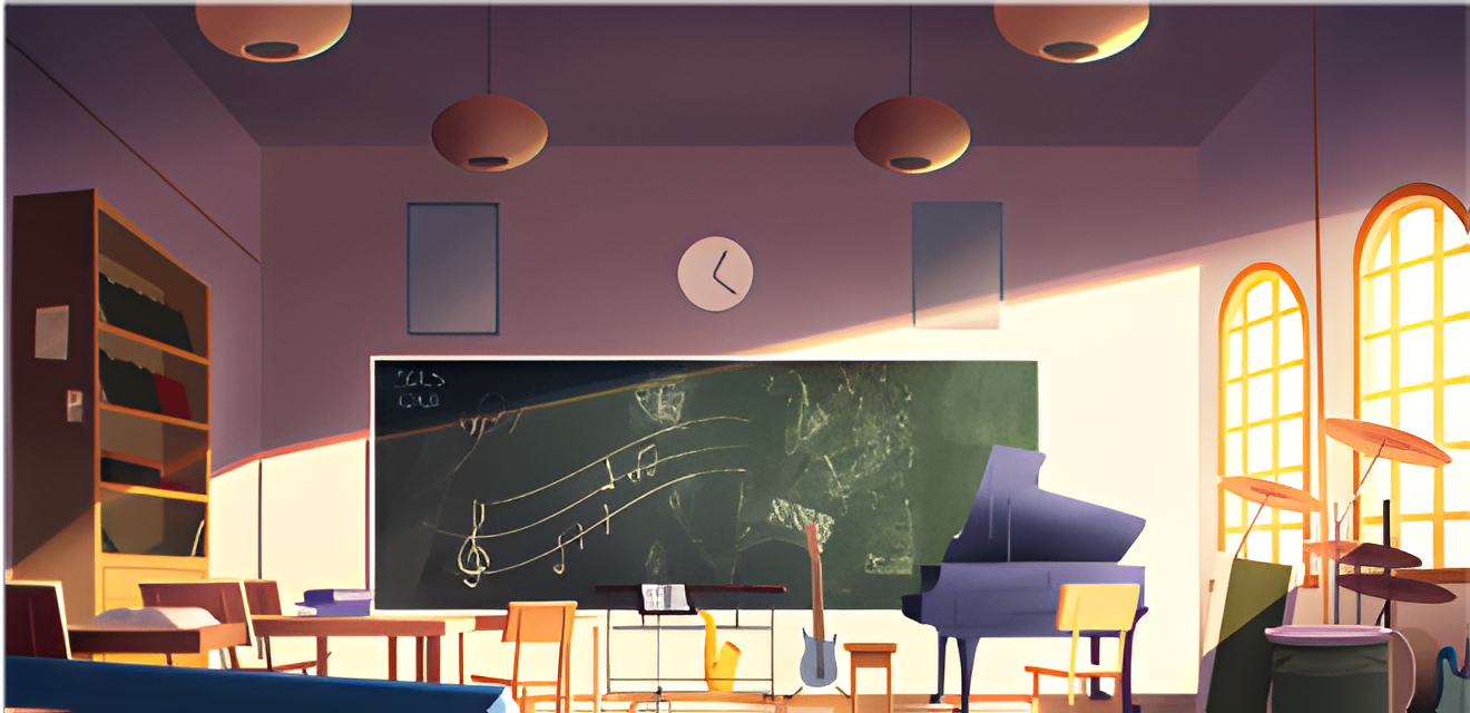
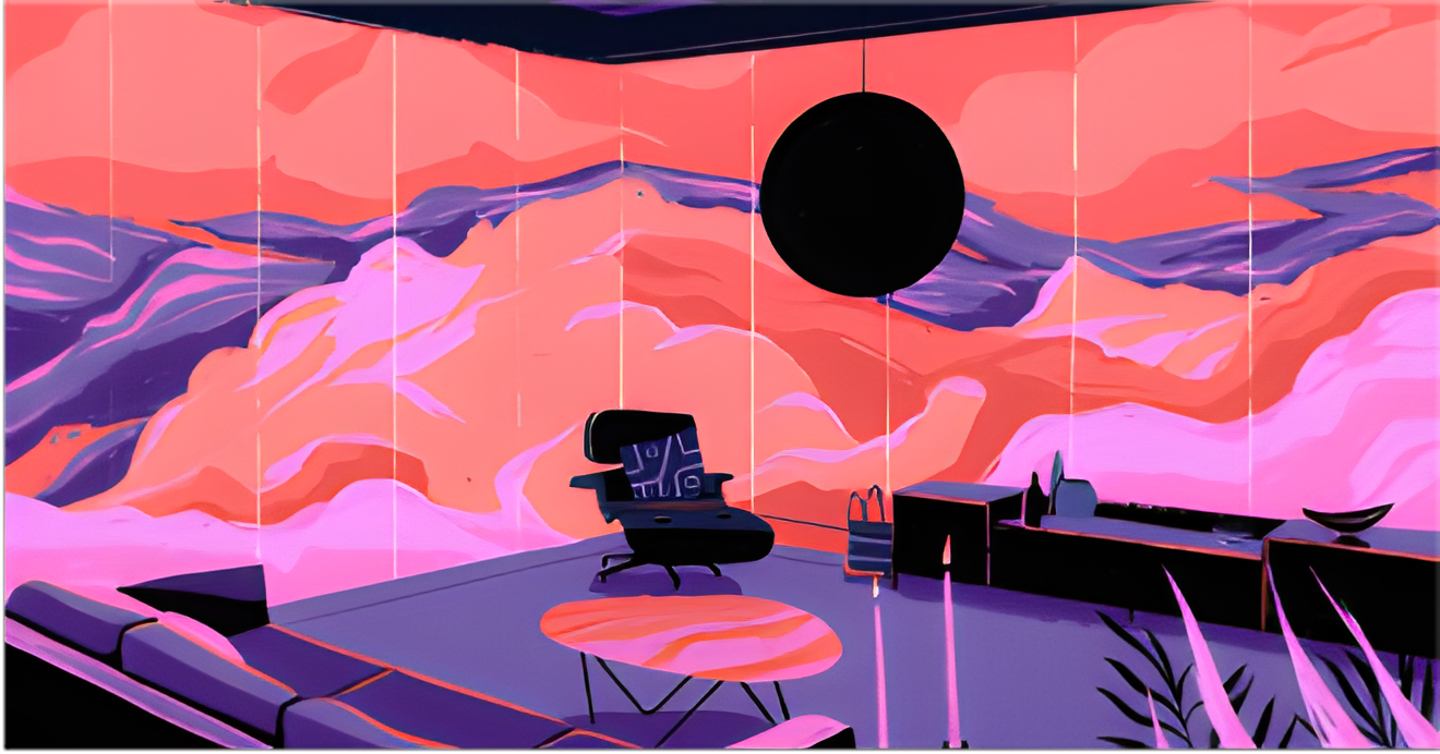
1. Universal Adoptability through illustrations and aesthetic tones, offering rich visual cues while reducing the cost of adoption for the wider demographic of Smart Homes (teens to elderly). Embracing the paramount value of privacy within the home, the brand creates a seamless connection through rich default visuals, harmonizing with personalized experiences to create unique relaxed and pleasant interactions.
2. Seamless Flexibility and Accessibility. The user can reach it all. By taking incremental actions, such as placing major buttons like the Appliance ON switches within thumb reach, we reduce the effort for this app, which research has suggested, will have daily use.
Next Steps
My recommended next steps for this project is primarily further usability. Additionally, the we can explore more methods of data visualizations for comparative consumption data, month on month, week by week, etc.

